Naoko Takeuchi wrote her Sailor Moon manga to be unabashedly feminine, with plenty of beautiful gowns, fairy tale imagery, and sumptuous settings like the legendary Moon Kingdom and Tokyo at night. And just like the hyper-masculine fight shonen classic Dragon Ball is meant for all audiences, so is Sailor Moon. Many anime fans grew up watching Sailor Moon, so there's a strong love for the earlier seasons fed further by sweet nostalgia. Sailor Moon screencaps are so popular in aesthetic blogs and social media pages that even people who've never watched a minute of the series recognize Takeuchi's characters and art style.
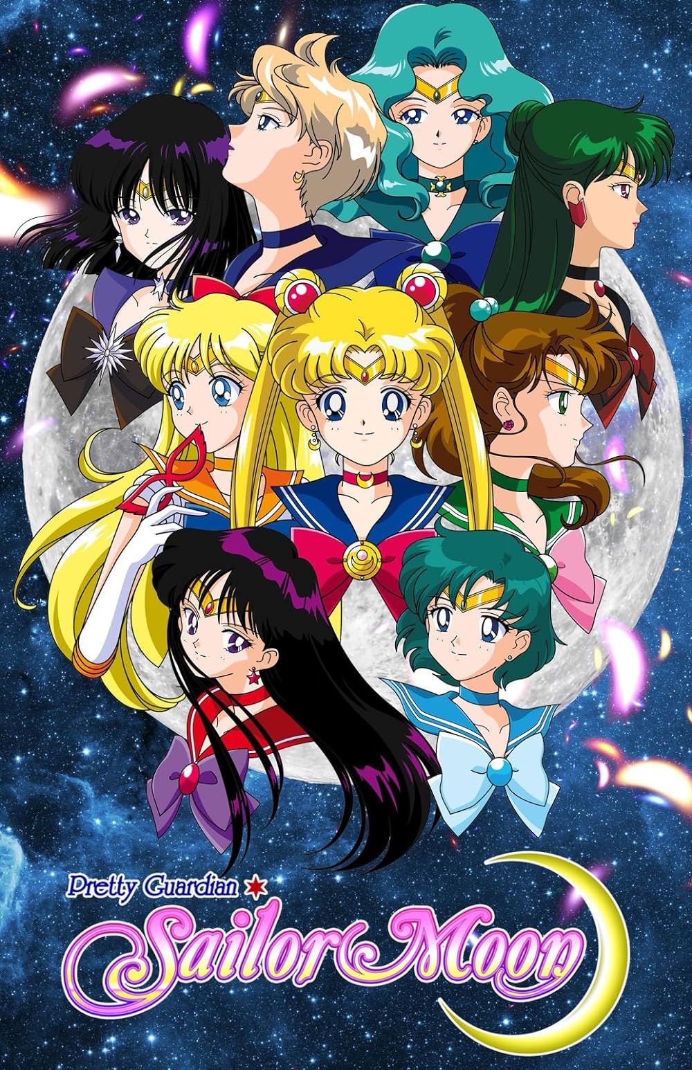
Sailor Moon is a shojo magical girl classic about friendship, winning love by moonlight, and fighting the forces of evil. Usagi and her fellow Sailor Senshi brandish their magical wands in the air and shout a transformation incantation; then they're swept up by masses of starlight, swirling natural elements, and dazzling color. Many fans associate the original Sailor Moon anime with a soft, pink aesthetic, and there are very specific reasons that they do so—partly because of the anime's dreamy color palette, and partly because of the way the early cel animation was preserved.
The Sailor Moon Color Palette
Sailor Moon has a very specific art style. Beyond '90s anime conventions like willowy legs; large doll eyes; and long, wavy hair, Sailor Moon incorporates a lot of celestial and fairy tale imagery. Sailor Moon was once Princess Serenity of the Moon Kingdom. The series has many flashbacks to Sailor Moon's previous life as a princess in a faraway world and the flashbacks have a dreamy, hazy quality to them. Stars dot the blue and purple sky, Princess Serenity's ivory gown billows in the night breeze, and mist softens the entire world, giving the audience a feeling like they're remembering a sweet, fleeting dream.
The Tokyo city sky is just as romantic as the lost Moon Kingdom's skyline. It's a wash of soft blue sky, buttercup yellow stars, and pale teal shadows. All of these color choices were intentional; Naoko Takeuchi and the anime production team wanted to create incredibly romantic worlds on Earth and in space. They are also a stark juxtaposition to settings like the Dark Kingdom, which appears to be underground. Those locations are meant to feel dreary, cavernous, eldritch, and cold.
These colors and settings capture the feeling of romanticized adolescence and girlhood, which fits perfectly with Sailor Moon. Even the Sailor Senshi's outfits have mostly soft colors (with the occasional bright ones, like Rei Hino's red and white shrine uniform). That's partly because pastel street-wear was very popular in the 1990s, when both the Sailor Moon manga and original anime adaptation were created.
Pink's Meaning in the Sailor Moon Anime & Manga
Only fans who check out Naoko Takeuchi's iconic concept manga art for Sailor Moon will know that she originally intended for Sailor Moon's hair to be pastel pink. Anime characters designed with pink hair are pretty commonplace, and it's generally thought to be cute and feminine, which fits Sailor Moon's personality and the tone of the series very well. Even though Takeuchi ended up scrapping pink hair for Usagi, she gave her daughter Chibiusa pink hair and a rosy-hued Sailor Senshi uniform to match. Takeuchi and the animation studio also incorporated the color throughout the series.
Sailor Moon is a total lover girl who gets crushes easily, so she's often blushing pink, or surrounded by symbolic pink hearts. The background turns sparkling pink when she has major transformation scenes and attack sequences. Even her Sailor Senshi boots and bow are a deep pink. Pink is also Usagi Tsukino's favorite color.
Pink wasn't always associated with femininity; in the English Regency period, it was actually associated with masculinity and women wore blue dresses to appear more soft and feminine. But for the '90s, pink meant girlhood. Pink kimonos are also associated with youth, health, flowers, and springtime.
The Pink Wash Was All a Happy Mistake
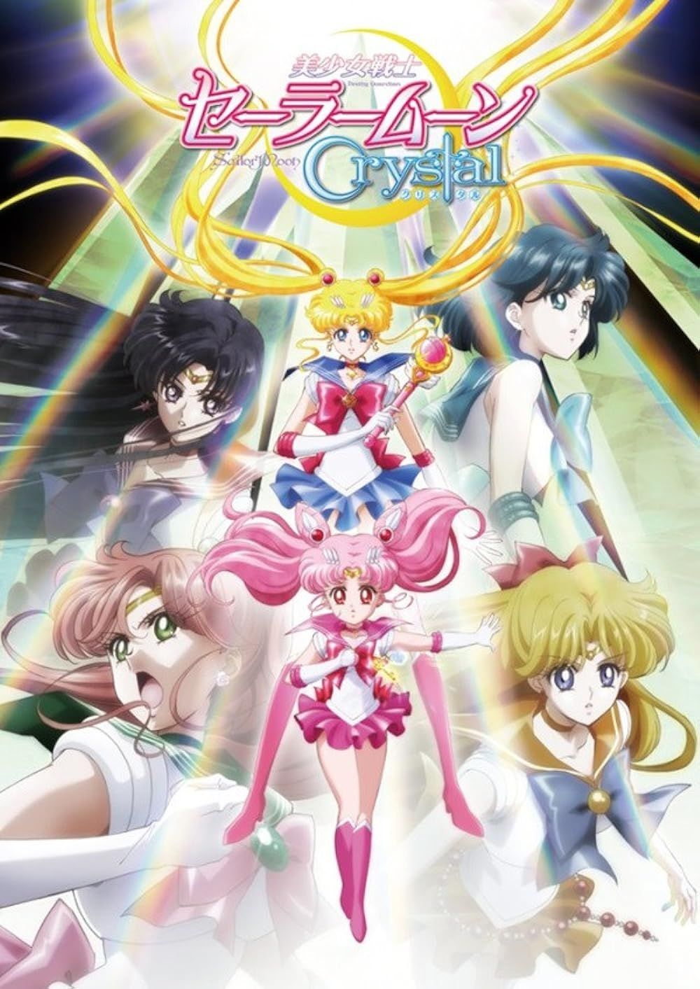
Fans noticed that the old version of Sailor Moon has a pink wash to it—especially older screenshots shared on platforms like Instagram, Pinterest, and Tumblr. Everything had a pink undertone in it, to the point where fans grew confused when they compared remastered episodes to older episode releases and screenshots. Fans scratched their heads and wondered if the pink tone that they always remembered was some kind of Mandela effect. When Sailor Moon Crystal, the Sailor Moon reboot, was released, it had the same fairy tale imagery and lush sky-scapes, but the colors seemed a bit off—a bit more vibrant and less dreamy than audiences normally associated with the franchise.
It turns out that the pink tone that fans remember so fondly was actually a film preservation mistake. David Miranda is an animation and restoration enthusiast, and he did an interview with Yahoo!News about this very topic. It's important to note that while David Miranda doesn't work for Toei, he knows a lot about anime restoration, and he pointed out that Toei's master proofs of many anime likely faded red over time. Miranda told Yahoo!News,
Toei & Classic Anime from the '80s & '90s
Toei has an extensive body of work; they produced not just Sailor Moon, but other anime classics from the '80s and '90s, like the Dragon Ball franchise, Saint Seiya, and Slam Dunk. Before CGI and digital rendering, all anime was hand-drawn cels. Moving from broadcast to VHS, then to DVD and digital media was a huge undertaking, especially for a studio with such a large catalog. The pink wash that Sailor Moon fans know and love was merely a preservation mistake, and that's why it's not as prevalent in later re-releases of the original anime series.
Toei hasn't released any statements on their preservation and digitizing process, so many fans and animation experts are left to make educated guesses. The proof seems to be in the comparison between older screenshots and newer, remastered screenshots, though. It just so happens that the pink and red-dominant faded works really well with the overall Sailor Moon aesthetic.
Some fans even say that they prefer remembering and watching Sailor Moon with the preservation flaws because it adds to the overall dreamy and sweet tone of the series. Sailor Moon is a remarkably accessible anime to watch, especially compared to the early 2000s, when the episodes were nearly lost to licensing limbo. Now they're all free to watch on Viz's YouTube channel. Unfortunately, though, if fans want to watch their favorite pink-wash version, there aren't many options for finding it unless fans held onto VHS recordings from years past.
Preservation Quirks Showed Up in Other Anime, Too
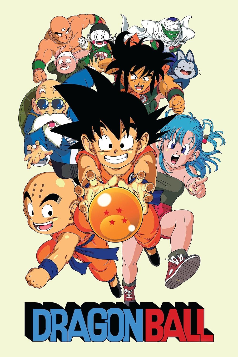
Dragon Ball is another Toei classic and, eventually, fans noticed an interesting discrepancy in its animation, as well. Dragon Ball is a shonen classic created by Akira Toriyama, and like Sailor Moon, it was many anime fans' entry to the anime world. It follows a young warrior named Goku from childhood into a superhero-level adulthood.
Though there are many different kinds of fantastical beings and magic in Dragon Ball, it mostly takes place on Earth. On Earth, the sky is mainly blue, but in Goku's world, the sky is more of a teal color. Some older screenshots even have surrealistic green skies. In remastered versions of the series, the colors are far more vibrant and accurate. The character Buu is more of a true peachy-pink in the remastered version than a pastel petal color. Likewise, the remastered Dragon Ball skies are a deep blue with very normal striations of color.
Once again, the faded hues and otherworldly color wash (in this case, teal) lends a pleasantly surrealist feeling. Fans also connect the lower-quality colors with nostalgia. There is a bit more official confirmation from the Dragon Ball team about the color changes. Dragon Ball directors said that the FUNimation version of the series is how it was always supposed to look.
Pros & Cons of Supporting the Original vs the Remaster
Anime purists will almost always argue that releasing a product closest to the original creators' vision is always best. It makes sense because the animation and writer teams are the ones responsible for creating the worlds that fans know and love. However, it's understandable that anime fans who grew up with certain nostalgic versions of the shows may get attached to lesser-quality colors—especially if the coloring mistakes add to the overall aesthetic tone of the series, as the pink wash does in Sailor Moon.